Have you ever landed on a website to look into some content only to be confused by the plethora of information on the homepage? Sure enough, that website likely has a problem with its information architecture.
What Is Information Architecture?
Information architecture (IA) is the process of effectively organising, structuring, and labelling content in a way that’s easily maintained so that users can complete tasks, find what they need, and understand what they found.
The Information Architecture Institute puts it more simply:
“Information architecture is the practice of deciding how to arrange the parts of something to be understandable… If you’re making things for others, you’re practicing information architecture.”
In a nutshell, IA is crucial because this provides web visitors with a positive user experience that entices them to keep coming back.
Still, why do some websites have bad IA?
If you think about it, some web developers build sites specifically to satisfy a business want that highlights information promoting the business. Not everyone puts much thought into what users need.
According to Econsultancy, 95% of users think a positive user experience is the most important factor when they visit a website, which also increases website conversion dramatically.
To become top of mind to our audience, we need to make sure our web visitors — our potential customers — always have a great experience with our brand online. It’s all about them. This is exactly the reason brands need to have a great information architecture.
Our potential customers should always have a great experience with our brand online. It’s all about them. This is exactly the reason brands need to have a great information architecture.
Tweet this
With a customer-centric IA, people will find it easier to understand what’s on your website and navigate their way through it seamlessly.
The founding father of IA, Peter Morville, considers it as a bridge builder that links users and content, strategy and tactics, units and disciplines, platforms and channels, and research and practice. You can check out his presentation deck “Understanding Information Architecture” here.
How Information Architecture Affects Digital Marketing and SEO
We know that search engine optimisation enables us to get high-quantity and high-quality traffic through organic search engine results. SEO best practices may have evolved over the years, but one thing remains true: SEO’s goal is to make sure that our website does well in search engines.
What some marketers may not realise is that a website’s information architecture is a crucial factor that helps with SEO. How you configure your IA determines how web pages are found, accessed, and linked to, among others. If done well, this dramatically improves findability on search engines.
What some marketers may not realise is that a website’s information architecture is a crucial factor that helps with SEO.
Tweet this
When you have a sound information architecture, your web pages are easily indexed and crawled, you get to provide a better user experience (and this means a decrease on bounce rates), and Google will reward you with site links.
A well-architectured website boosts your site’s visibility on search engines. When someone searches for something on your website, Google is able to provide accurate data because your site content is organised, labelled, and linked properly.
This goes to show that what’s good for IA is good for SEO.
Now that you know why marketers should care about information architecture, let’s dive into the stages of building a user-centric information architecture.
How to Build a User-Centric Information Architecture
Before we get on with the process, there are a few imperatives that should be met.
First, you and your team need to be clear about what your business strategy and business model are. After all, your website information architecture needs to be aligned with your overall business goals in order to be effective.
Your website information architecture needs to be aligned with your overall business goals in order to be effective. So you need to first be clear on your business strategy and business model.
Tweet this
Second, you need to have a clear understanding and anticipate user behaviour on your website. What will they be looking for? How will they navigate through your site and get the information they need? Do they know how to use a website?
You also need to remember several things: This is a journey from many directions; people don’t enter and exit the same way every time. Make sure there are next steps and relevant calls to action throughout your site architecture.
To get started, here’s what you can do to create your site’s information architecture.
1. Gather Questions and Tasks

To develop a user-centric website, it’s not enough to know what you want to say to customers. The right question to ask is, “What do users want to know when they land on my website?”
If you want to rebuild your IA or starting fresh, the first thing you want to do is collect the questions and tasks that web visitors want to complete on your website.
To discover these insights, here are some things you can do:
- Brainstorm with your team
- Look at analytics and keywords and phrases that people use on your site
- Run a survey
- Look at your social media channels
- Conduct workshops where you invite users to help brainstorm questions or tasks
You may also want to explore the game-changing moments in your customers’ lives that matter to your business. These are called micro-moments. Coined by Google, a micro-moment is “an intent-rich moment when a person turns to a device to act on a need”.
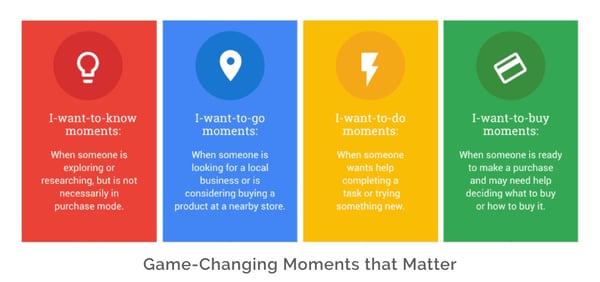
There are four moments that really matter. These are
- “I want to know” moments
- “I want to go” moments
- “I want to do” moments
- “I want to buy” moments
Brands who understand these moments, anticipate, and deliver on their needs become more relevant to their customers, thus experiencing a boost in their mobile conversions and a better engagement.
2. Conduct Top Task Analysis
It could be that users visit your website to learn from your blog. Or perhaps they want to know what you do and why you do it. Or maybe they’re interested to know the people behind the brand.
If this is the case, then nothing should distract them from locating that content. You don’t need to offer them a plethora of extra information they don’t actually need.
When Gerry McGovern, an absolute thought leader on online customer experience, realised that most web visitors go to a certain website to read or get information on only a small subset of a website’s content, he developed a process called the top task analysis.
McGovern defines this as “a model of management that puts the customer at the center by measuring success based on the success of the customer at completing their top tasks.”
This process helps you get very specific on the items or topics that users care about. It helps you understand users’ goals and what they want to achieve — this means, before going through this step, you will have already conducted the previous step, which is collecting user insights.
It’s important that you conduct this before the design process.
- Start by listing high-level tasks. These are the features, content, and functionality you want your users to consider.
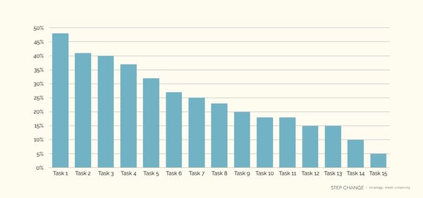
- Out of the exhaustive list, let users vote the top three to five tasks that are important to them.
- Analyse the results. Count the votes each task received. Divide that by the total number of voting users, and express the result in percentage. Sort it in descending order. What your users consider as top tasks would then be the ones with the highest percentage. This does not mean you can discard the small tasks; this means you need to focus on the top tasks and make sure that they can be completed effectively.
3. Conduct an Open Card Sorting
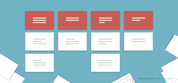
A well-tested user-focused technique, open card sorting allows you to understand how your users group information. This can help you better structure your website, decide what content to place on the homepage, label categories, and design your navigation. And by better, I mean that it’s mainly customer-centric rather than organisation-centric.
Here are the steps in performing an open card sorting session:
- Ask the participants to list important content topics (or those that are frequently used) in your existing website. If your website is new, list the types of information and topics you want on your website.
- Give a participant a deck of cards, containing the topics, with no pre-established groups. The task is to sort them into groups in a way that makes sense to him or her. Limit to sorting 30–40 cards to avoid participant fatigue. To group the cards, the participant may tape them on the wall or spread them on the table.
- The participant will then explain why the topics are grouped that way.
- The participant will then use a different coloured card to name the groups. Ask, “What key phrase would you expect to see on the homepage or second-level page that would lead you to that specific topic group?”
- Take a photo of the sorted group of cards for documentation and analysis later on.
- Reshuffle the cards for the next participant.
4. Develop and Validate Your Information Architecture
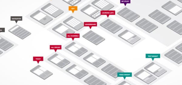
Image source: Dribbble
Based on what you’ve learned from research, task analysis, and the sorting, you can now draft your website’s information architecture. You may use the labelling and groupings.
To validate its effectivity, you need to do another type of card sorting — this time a closed card sorting. What this allows you to do is check that your top-level IA agrees with your user’s mental model.
Start Building Your Information Architecture
As a business with an online presence, you want to leave a good and lasting impression on web users. There are thousands of websites out there trying to captivate your audience’s attention. It’s no surprise that having a great IA is becoming increasingly important. This may just be your differentiation.
Your goal, then, is to make sure that they get the information they need from you, effortlessly. You want them to come away thinking how easy it was to navigate through your website so they keep coming back for more.




![#KatieTalks to Step Change’s Robert Steers [PODCAST]](https://blog.hellostepchange.com/hubfs/BLOG/Posts/5-Connection/katie-talks-robert-steers.001.jpeg)


