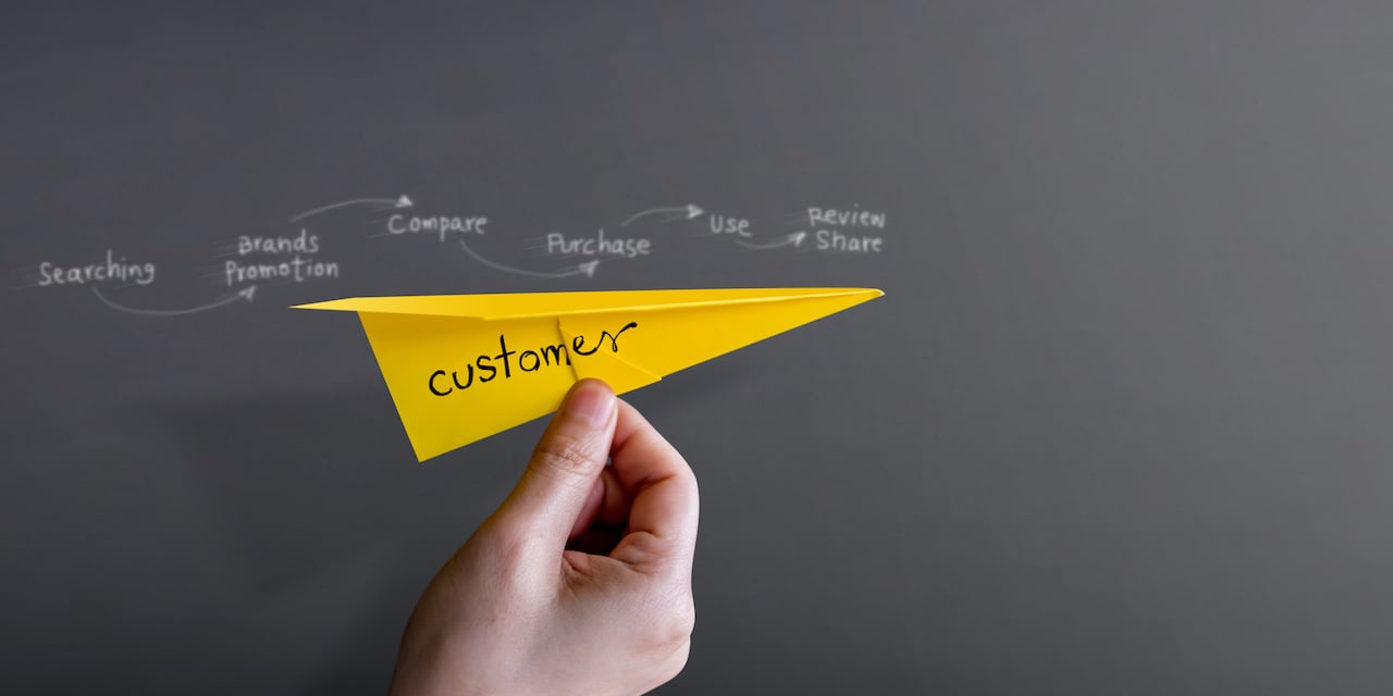
Every touch point you have with a potential customer will influence their decision to buy from you. Your website is one of these touch points. Today, our focus will be on how to make your website, simply frictionless.
Frictionless Design
Too much choice is a barrier for decision making. Choice leaves people feeling inundated, so they are more likely to make no decision rather than any decision.
This extends to web design. Websites should not have too many buttons to press, too many pages to read and too many steps to take to find the information they were looking for. Maintaining the ease of navigation should be your goal. Targeted and specific information means users will remain engaged for longer.
Just like meals, each page needs to be digestible. The main message should be communicated at first glance. Each button in the navigation needs to capture the essence of the pages beneath it. There should generally be no more than 500 words per page.
A great idea is to use video in your web design. Explainer videos are a good way to break up the page with visuals and can convey the information you want in a more engaging manner. Sites with video have an extra two-minute dwell time compared to sites that don’t. Using the word “video” in a subject line can boost email open rates by 19% and increase email click-throughs by 65%. Just to show you some creative video ideas, here are some examples of videos we’ve produced for our clients:
TYRO Honest Job Translator from Step Change on Vimeo.
AGL Smarter Ergonomics from Step Change on Vimeo.
Brainstorming for Frictionless Design
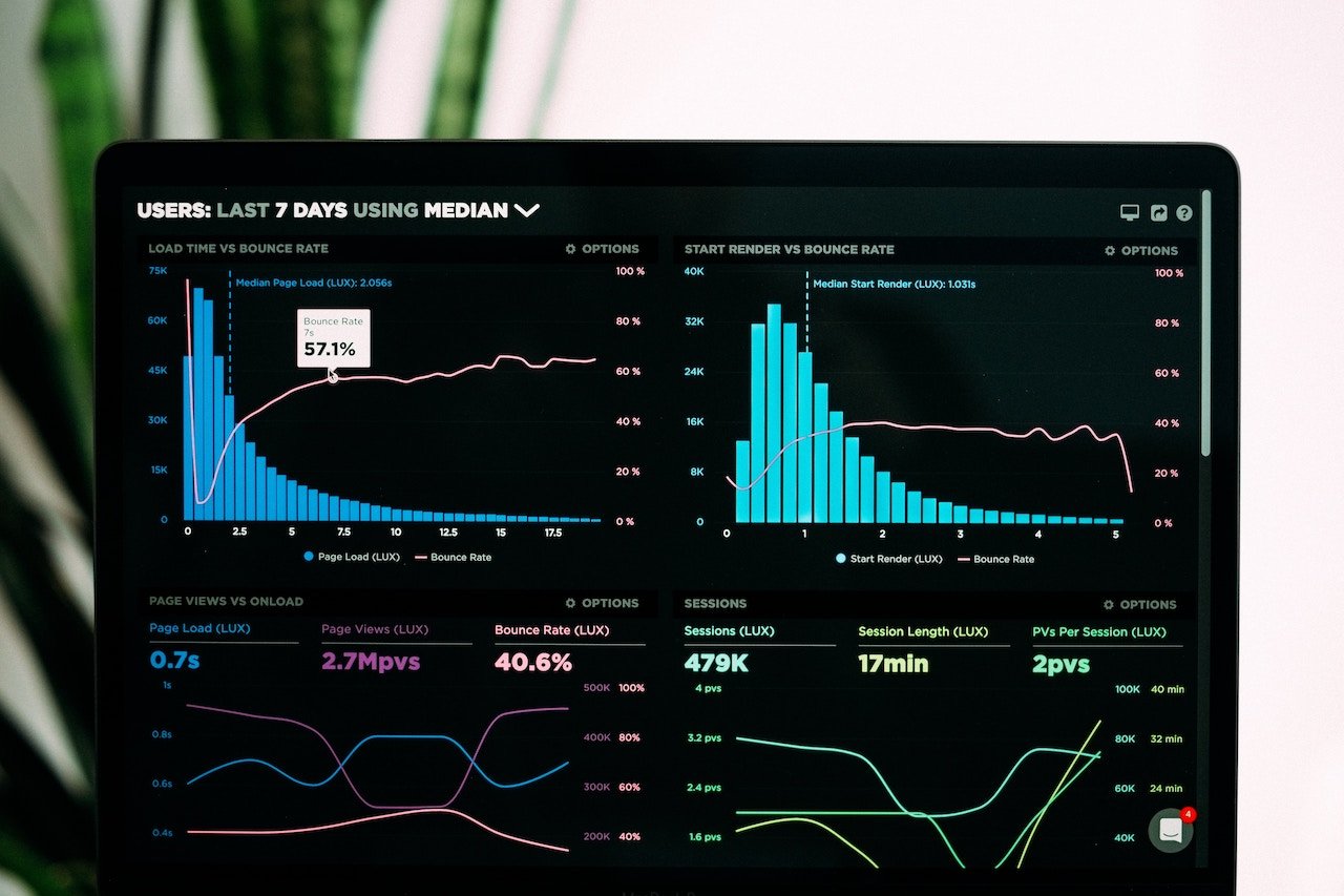
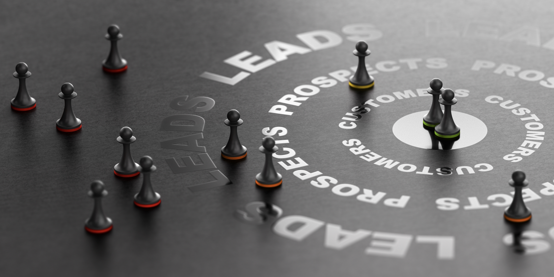
In order to have a frictionless website, you need to understand the most important pages on your site. Analyse your data to compile a list of the most popular destinations on your site and put these in the navigation bar.
Think about the different customer journeys and map these out on your website. The easier your website is to navigate, the longer users will stay on your website (increasing the chance of them buying).
The general rule is to look at each customer journey and see if they can reach their desired destination in two to three clicks.
Taking Action
Your goal should be for each visitor to leave your website with a strong understanding of what your company provides. They should leave with all their answers and be clear on whether or not they are going to buy from you. Having a frictionless website brings you closer to fulfilling these objectives.
Written by Lina Lau, Digital Executive at Step Change
 Lina’s natural flair for Java code meant she was presenting theories to her own lecturers before even graduating. A computer science and law major, she brings unique ‘systems meet psychology’ approach to marketing and strategy. Strategic problem-solver at heart, she honed her tech skills by teaching herself how to hack and understanding crypto currencies. Her diverse range of skills and natural love for entrepreneurship and understanding businesses led her to Step Change.


![#KatieTalks to Step Change’s Robert Steers [PODCAST]](https://blog.hellostepchange.com/hubfs/BLOG/Posts/5-Connection/katie-talks-robert-steers.001.jpeg)