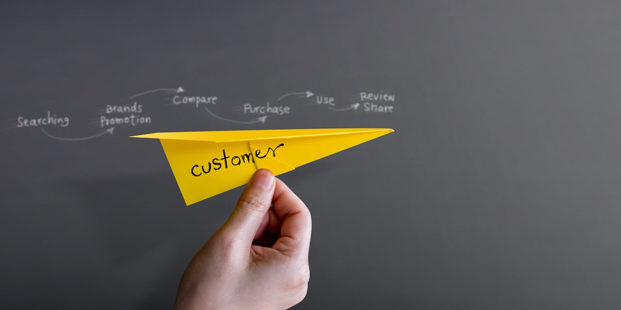
If you’re doing online marketing, there’s no doubt that you are interested in maximising the rate of conversion when potential and returning customers visit your page.
A lot of marketers have released tips and info on the tricks and techniques they’ve developed that have worked for them. In this blog post, we talk about 100 ways you can improve your conversion rate. If you increase conversion across 100 factors by 1%, that compounds to a 270% improvement in overall conversions, without spending anything more on marketing.

1. Fresh Design
27% Improved Conversion Rates
A fresh and clean-looking landing page is critical to success. As trends change and the power of IT technology grows, the standard for what makes a site slick and beautiful changes.
2. Action-Oriented Content
94% Improved Conversion Rates
It’s an age-old truism in sales that you direct the customer by speaking in terms of the completed sale. That is to say, you use language that puts an image in their mind of how they will benefit from the purchase after it is complete. Such language should be action- and future-oriented. WebSavvy has a list of 1,378 words that compel web visitors to take action; you will find this list a useful guide in your Google AdWords marketing.
3. Simplify
225% Improved Conversion Rates
Customers must enjoy looking at your page, and they must feel confident that they will be able to navigate it successfully. Simplicity is the way to do this, and it should be a running theme through your design process.
4. Use Faces
102.5% Improved Conversion Rates
Any filmmaker will tell you that there is no better way to add production value than to artfully incorporate the human face. In your website, you want happy and confident faces that the customer can relate to.
5. Improved Value Propositions
128% Improved Conversion Rates
Sometimes called an upsell or special offer, an improved value proposition is a bargain you attempt to make with potential customers where they can get more for taking a specific action. One good example of this is offering free shipping on orders over a certain dollar amount.
6. More Prominent CTAs
591% Improved Conversion Rates
Calls to action usually come at the end of a piece of content. But that’s formulaic. Visitors usually know they are being sold something, so being upfront about it can be advantageous; also, if they are already sold, you’re lowering the risk of talking them out of it.
7. Include Reviews
35% Improved Conversion Rates
Most customers trust other customers far more than they trust a merchant’s sales pitch. If you have good reviews, it is in your best interest to make them readily available.
8. Reformat Pricing Pages
25% Improved Conversion Rates
Pricing pages should be clean and friendly. Customers should be able to read them easily. Any additional frustration associated with pricing is deadly to sales.
9. Home Page Changes
300% Improved Conversion Rates
The changes don’t need to be extensive. By simply changing a single prominent image, which then lets customers know that your offerings are up-to-date and competitive, it could actually convert 2–3x better.
10. Adding Testimonials
34% Improved Conversion Rates
Like reviews, testimonials give potential customers detailed and, presumably, unbiased information from experienced users. If you have high-quality testimonials, your more discerning buyers will come back again and again.
11. Redesigned Site Flow
2.30% Improved Conversion Rates
Revision is key to any creative process. The flow chart your site is designed around is no different. Redesigning it is key to making the visitor experience more satisfying.
12. Using Exciting Button Colours
21% Improved Conversion Rates
The design rule for clickable buttons is this: make them look like candy. They should be bright, shiny, and gleam like glazed sugar.
13. Red CTAs
2.5% Increased Conversion Rates
Of course, this technique is content sensitive — but if it is appropriate to colour your call to action red, the benefits are proven.
14. Purchase Protection with Bonds
10.4% Improved Conversion Rates
Online shoppers know there’s a risk that their purchases can be damaged or lost in transit. Offering the option to leverage purchase protection lets you retain customers who insist on the security that bonds provide.
15. Security Seals
7.6% Improved Conversion Rates
Placing your golden seal of approval, or that of a trusted third party, allays the fears that many online buyers have. This also represents an opportunity for you to add colour and flash to your landing pages.
16. Incorporating Google Site Searches
11% Improved Conversion Rates
Anything you can do to aid the customer’s search efforts by implementing Google searches will be appreciated. This will reduce bounce rates and increase returns.
17. Leveraging Intuit
211% Improved Conversion Rates
Proactive chats give you the opportunity to answer questions and solve problems early in the customer experience. As long as humans are smarter than machines, proactive chats are a powerful way to smooth out the imperfections in the customer experience.
18. Highlight Key Features
21% Improved Conversion Rates in 30 Days
Crazy Egg managed to boost their conversion rates by highlighting the following major changes:
- Try before you buy
- Brand alignment with audience
- Utilising metrics
19. Remove One Image
400% Improved Conversion Rates
Find the least appealing image on your landing page and get rid of it. This is a good way to start when cleaning up and redesigning your pages. Say goodbye to the weakest link.
20. Incorporate Image Sliders
30% Improved Conversion Rates
Surely you’ve seen these. Image sliders in the place of a page banner is a good way to make your site look sleek and add a great deal of colour and information in a way that is easy to digest.
21. Proof of Authenticity
107% Improved Conversion Rates
This is important when you deal in big-ticket, finely tuned products and services with an artistic or high level of demand for quality. There are a number of ways to achieve this, and it is absolutely indispensable where product prestige is a factor — such as with fine watches, high-quality cameras, and the like.
22. Upfront Prices
100% Improved Conversion Rates
Many times, customers know they want to buy before they even reach your site. For these visitors, they only want to see that you have what they are looking for and that the price is acceptable.
23. Remove Low-Performing Filters
27% Improved Conversion Rates
A misplaced product filter can limit the likelihood that your visitors will find what they are looking for. This is a point where using metrics can be key. Some filters are helpful, and some are a hindrance. Sorting out the bad ones from the good ones is important to the performance of your pages.
24. The Social Sharing Superboost
3600% Improved Conversion Rates
The “Share this” tool is a must-have. People love to share valuable info and products with their social circles. Adding the familiar tool with logos from widely used social media sites is a powerful way to let word-of-mouth advertising work for you in a big way.
25. Tackle Cart Abandonment
35.26% Increase in Conversion Rate
Beautifying and simplifying the shopping cart page is crucial to reducing abandonment. This is the point where the customer lays down their money — that means it needs to be slick, tight, and attractive. Don’t forget our glossy-button tip!
26. The Bigger Button Boost
32.5% Improved Conversion Rates
Remember that candy-coloured button we talked about? Well, it turns out that making key buttons bigger also improves their appeal. When people know what they want, a big button offers them a no-brainer decision.
Site Feature Optimisation

27. Boost Conversion by 400%
Voices.com added the following features to achieve significant gains:
- Endorsement-rich banners
- Visitor segmentation
- Demo videos
28. Product Package
233% Improved Conversion Rates
You may have noticed that sometimes, different pricing packages are practically the same. This doesn’t mean that some customers may prefer one to the other for essentially irrational reasons. Remember, just because a given rationale to buy is irrational doesn’t mean it isn’t compelling to a segment of your audience!
29. Expedia Eliminated a Field for $12 million
It’s a simple case of simplifying the account creation process. In Expedia’s case, they removed a text field from the credit card info section — a high-stress portion in the sign-up process.
30. Add a Checkbox to Your Home Page
11% Improved Conversion Rates
Customers who are ready to commit don’t need to hear your sales pitch. Offering them the chance to express interest early on will save them a lot of grief — and it will save you a lot of sales!
31. Adding Demos
46% Improved Conversion Rates
Thetaboard created a demonstration for their landing page that lets customers sample the buying experience and boosted their conversions by nearly half. It’s also a good way to relay product information. If your customers enjoy the demo, they will spread the word even before they get their hands on the actual product.
32. Add a Guarantee
41% Improved Conversion Rates
By adding a satisfaction guarantee, you place a higher burden of performance on yourself, but you can also boost buyer confidence significantly. You can think of this as a good way to bring yourself up to the next level when it comes to customer satisfaction.
Optimised Functionality

33. Smoother Navigation
The Olympic store boosted their conversion rate by 7.74% by simplifying their navigation flow chart. The result was a product page with more information that is better organised.
34. A/B Testing
114% Improved Conversion Rates
Remember the old “Brand A” vs “Brand B” commercials? There’s a reason those were so popular — they work. A/B testing also gives your audience a chance to express their preferences and feel more catered to while providing you with valuable marketing data.
35. Change One Word
161% Improved Conversion Rates
Remember what I said about removing one image? Well, the same applies to the language you use in your copy. Mark Twain said, “The difference between the almost-right word and the right word is really a large matter. ’tis the difference between the lightning bug and the lightning.”
36. Personalise Your CTA
22% Improved Conversion Rates
There’s a fine line between a good call to action and a cheesy one. The way to overcome this is to have CTAs that are customised to different segments of your buyer demographics. Your site flow should separate different types of buyers, and this will give you the opportunity to write specialised CTAs for each of them.
37. BliVakker.no Boosts Conversions by Removing 3 Form Fields
11% Increase in Sales
This Norway-based beauty product merchant increased their sales simply by eliminating a few fields from their registration process. As I have already discussed, the sign-up process tends to shed a lot of customers. Tidying it up as much as possible is very important.
38. Landing Page Brevity
13% Increased Conversion Rates
Landing pages are like the hook in a pop song; they lead you in and get your interest fast and powerfully. They should be pretty, simple, and effective.
39. Fewer Questions
The airport parking service Flying Scot achieved 35% better conversions by removing some redundant questions from the engagement process. Considering the nature of their business, it’s easy to see how eliminating some potential frustration is a good idea.
Brand Reputation

40. Discounts!
121% Increase in Revenue
There are a lot of ways in which discounts can boost engagement while offering maximum value to your bottom line. You may have to cleverly sort these out, but the more you offer, the better.
41. CarWoo Enjoys 40% Boost
This dealership sorting site turned its entire business model around by simplifying and beautifying their home page. They added colour and flash while eliminating unnecessary fields.
42. Bigger Product Images
9% Increased Conversion Rates
When your visitors are looking for a product, a good way to get them hooked is to show them a big, bright, and highly detailed image of the item. The clearer the image, the more they will feel that it is an accurate representation of the product.
43. Luxury Hotel Boosts Conversions by 32.12% with Prominent CTAs
Customers for this luxury hotel in the heart of London know what they want before they arrive at the company’s site. This is a great example that beating around the bush is not optimal.
44. Video
100% Engagement Boost
Few people on the internet have the time or the patience to read long descriptions of products and services. Offering content in the form of a video is a great way to hang on to low-patience surfers. One of the best things about it is they can let the video play in the background and listen to your message while they play a game or manage social media.
45. Change Button Text
83.4% Improved Conversion Rates
You’ll need to run some metrics to make sure this is right for you, but if it is, changing the text within a button image can change the way visitors respond to the idea of clicking it.
46. Long Home Pages
30% Improved Conversion Rates
Landing page brevity is good for sales. Think of it as the lobby; it should be simple and directional. The home page, by contrast, should answer all your visitor’s questions and contain the bulk of your sales pitch.
47. Video Screencap Optimisation
70.9% Improved Conversion Rates
When you post a video, the screencap matters. While it’s good to show a close-up of your product or depict your service as boldly as possible, sometimes it causes more harm than good. This case study proves that it helps to show the environment in which the product or service is used.
48. Overcome Objections
44% Improved Conversion Rates
In logic and rhetoric, we often do the same thing by addressing counterpoints to our argument early in a speech or article. Your copy should do the same thing. Address likely concerns with a handy Q&A or bulleted list.
49. Demographic Targeting
19.55% Increased Conversion Rate
If you don’t know who your audience is, all your sales will essentially be accidents. Take the time to conduct surveys and perform as much research on your target audience as possible.
50. Customer Review Widgets
58.28% Increase in Sales
Express Watches knew that their reviews were a valuable resource. They capitalised on this by making reviews easy to read without losing track of the content by incorporating a customer review widget.
51. Removing Social Proof
You learned earlier that adding social proof could boost conversions. Here you see that sometimes, removing them is the right thing to do. The Calpont company found that in their case, removing social proofs was the right thing to do — once again showing that anything you do with your landing page should be based on research and careful gauging of the metrics.
Landing Page Optimisation

52. Majestic Wine Gets 200% Better Conversions with Redesigned Landing Page
The United Kingdom-based Majestic Wine added an updated site flow and bold new colours to improve the visual appeal of their landing and home pages.
53. 232% Better Landing Page Results
Openmile.com earned themselves a huge boost by making a few adjustments to their landing page. They exchanged big static images for huge colourful CTA buttons near the top of the page. They also added enormous blocks of colour that separate service types and customer categories for better targeting.
54. Below-the-Fold CTAs
This dispels a common myth that the above-the-fold CTA is superior. A Danish company found just the opposite when they changed the location of their CTA and sign-up field.
Better Calls to Action

55. Change One Word in the CTA
90% Click-Through Rate
It’s really amazing how much difference a very small change can make. Of course, you should look at your CTA as a poetic, linguistic construct in so far as it is better the more brief and precise it is.
56. Donations Increased 189%
The Heritage Foundation earned itself a massive up-tick in donations by placing their CTA at the top and moving their registration form to the bottom.
Stunning Visuals

57. Adjust Images
Typographical landscapes are a critical element of any advertisement space. Simply by adjusting the locations and proportions of a few images, Forex Trading boosted their conversions by 99.4%.
58. Bigger Button = Lower Conversions
Every rule comes with its exception. In this case, the “Create My Account” button was made less appealing by enlarging it. It’s worth noting that it was rendered in an unpleasant pea-green, which appears to have hurt its effectiveness.
59. Remove “My” from CTA Buttons
32% Increased Conversion Rates
Using the word my in product names and CTA buttons became big around the same time that MySpace.com made its big splash in the 2000s. Today, consumers correctly see it a less-than-genuine attempt to create a sense of personalisation or ownership.
60. Bigger Product Images
Skinner Auctions ran some A/B testing that allowed them to boost the performance of their images by 63%. The result was that the winning images were bigger, bolder, and brighter.
61. Communicate Value Visually
With certain product types, such as gambling portals and investment brokerages, it’s important to demonstrate value with graphs, stats, and hard data. Betting Expert boosted their conversions by 31.5% by doing just that.
62. Remove Navigation Links
A simple way to improve conversions is to get rid of all the links. Offering visitors a distraction-free screen is preferable to the alternative.
Clarity in Messaging

63. Make Your CTA Crystal Clear
Your CTA is the last thing you get to say before your visitors make their decision. By the time they see it, they’ve probably seen a lot and are done reading about the product or service. Make sure your CTA is as simple and accurate as possible.
64. Use Clear, Easy-to-Understand Images
Your images should be bold, simplistic, and not open to interpretation. You want the message to be singular and supportive of your brand.
65. Feature Glowing Testimonials
I’ve mentioned the importance of having user testimonials. Now I want to highlight the benefits of featuring the best ones by placing them front and centre on your landing page. Remember, people trust other users more than they trust you, so why not give them what they want?
66. Change the Colour Scheme
While bright, glossy, and sugary-looking colours are ideal for buttons, calming blocks of pastels are great on large unresponsive areas. Of course, this all depends on the nature of your site. Whatever you choose, however, err on the side of bold simplicity.
67. Highlight Your Free Trial
14.5% Improved Conversion Rates
MuscleandMotion.com gained a significant boost in conversions by doing something they should have done long before — offering free samples. In some industries, this form of promotional is non-negotiable; it’s a must!
68. Focus on User Needs
The user comes to your site to fill a need or a want. Your job is to facilitate the filling of that need. By focusing your copy on the consumer’s needs, you cut right through the noise and get to the heart of the matter.
69. No Sign-Up Forms on Landing Pages
Placing a sign-up form on a landing page is like setting up your lobby like a bedroom — it may sound fun at first, but it just doesn’t work. Vendio.com boosted their conversions by 60% simply by getting their sign-up form off the landing page.
70. Change CTA Locations
CTAs are fickle things. Sometimes they are best at the end; sometimes another spot is ideal. You can take a cue from a proven competitor, or you can do active research. Either way, CTA location bears refinement.
71. Word-Smithing
36% Boost in Conversion
Streamline Metrics changed the text on their free quote button from “Submit” to “Get Quote Now.” The adjustment to the wording gained an increase in conversion rate, as it’s more informative. That’s something that should work for any business.
72. Add Seasonal Messages
Everyone appreciates a bit of on-point seasonal messaging. During the Christmas season, sites without a little holiday cheer cannot compete with those that have it. Combine this with some festive promotions to double your Holiday conversion bonus.
73. Product Page Optimisation
The Corkscrew Wine boosted their conversations by 148% simply by optimising their product page. This is likely due to the sensual nature of their product, but no doubt just about any brand could stand to do the same.
74. Think about Your Buyer Personas
Of course, your landing page is only as good as the home page it links to. Medienreich, a software education provider, improved their conversions with a few simple tweaks to their home page to show the right information in the right order, using as a guide their buyer personas.
75. Checkout Click-through Optimisation
Wikijob earned itself a 34% boost in click-through rates by moving their testimonials to the fold. This gave visitors the boost they needed to complete the journey to checkout.
14 Home Page Optimisation Must-Haves

76. Snappy Headline
Your headlines should stand out instantly. You have about three seconds to get your message across.
77. Communicate Benefits
Your visitors should have a good idea of why they have come to your site. A good way to do this is to offer a bullet list about a quarter of the way down the page.
78. Effective Subheadlines
Where headlines get a point across quickly, a subheadline supports it by offering a bit more information after the headline delivers the all-important eye-catching phrase.
79. Primary CTAs
A primary CTA tells your visitors why they should learn more, whereas a final CTA makes the sale. Primary CTAs belong somewhere within the first one-third of your home page content.
80. List of Attractive Features
Showcasing the features of your service is an important way to keep the content oriented towards the needs of your users. The middle to three-fourths of the way through your home page is the right spot for these.
81. Customer Proofs
A few short quotes from satisfied customers can be very powerful on a home page. You can keep them brief and link to a review page so that they take up very little room for maximum effect.
82. Indicators of Success
Displaying some well-designed and concise proofs of performance like graphs and statistics is a sure-fire way to bolster your argument before hitting them with your CTAs.
83. Support Images
Just as your headline might need help from a subheadline, leading images also need their sidekicks. Supporting images can be smaller and less flashy with a more nuanced intent that supports the direction of your leading image/s.
84. Smooth Navigation
Your web visitors should experience your website seamlessly. You can do this by mapping out a simple, direct, and clear path from your home page to your sales page, without missing any important beats along the way.
85. Content Offer
Featuring an informative and entertaining content — such as whitepaper, ebook, or guide — is a great way to get them to come back again and again. When your content is valuable enough, just offering it as an incentive really does work.
86. Supporting CTAs
CTAs work because they are right to the point. But like your headlines and images, they can use a bit of back-up. This is largely because the visitor needs to be wooed into the final conversion oftentimes. Using a series of CTAs can help to keep you from coming across too ‘adsy’.
87. Valuable Resources
96% of your visitors are unconvinced when they arrive. Giving them access to research and evidence that your offer/product is valuable can help out a great deal. Keep your resources section small; however, keep in mind that too many links can take your potential customers too far out of the way.
88. Trust Badges
Like the golden guarantee seal, a nice bright trust badge from an authoritative and trustworthy site is an excellent way to bolster buyer confidence. It lets your visitors know that you are legitimate and offer a high-quality service.
89. Faster Landing Page Rendering
Internet users respond to speedy page loading times like a weary traveller responds to a sweet smelling breeze. That’s why you want to keep your landing page as simple as possible. Think of it as a Welcome to Your Business sign; population — you.
Filling in the Gaps

90. Follow the Visual Hierarchy
Underwater Audio improved their conversion rates by 35% simply by adhering to the principle of the visual hierarchy. This means laying out the texts and visuals in a certain way to make sure your content is read the way you want it to be and they end up clicking the CTA.
91. Freemium to Free Trial
People are getting tired of the Freemium ploy. They see it for what it is, a lure to a menagerie of advertisements. Aculty Scheduling gained a 268% boost in conversions by ditching their freemium model for a free trial offer.
92. Try Different Headlines
As with every element of your home page and landing pages, you need to experiment with headlines. CityCliq improved their conversion rates by 90% just by trying a few different headlines.
93. Adjust Your Headlines
37signals achieved a 30% boost in sales just by adjusting the wording of their headlines a little. Surprise, the winning version of their headline contained the words “Free Trial.”
94. Experiment with Everything
The online diabetes logbook Care Logger earned a 72% increase in user conversions by experimenting with their home page headline, sign-up button colour, and sign-up button text.
95. Add a Navigation Bar
Slideshop enjoyed a 34% increase in sales when they replaced the sidebar on the right side of their home page with a navigation bar on the left.
96. Demos
Offering a nice demonstration in video form can be entertaining, relaxing, and give customers the feeling that they have seen the quality of your product firsthand.
97. Remove Content
Landing pages should be simple and strong. They should exude the “You have arrived” feeling. Assessment Day improved their conversions by 62% by simply paring down their landing page.
98. Show Images in the Site Search Field
This relatively recent finding shows that people need a bit more than the old-fashioned empty search field to get them to use the most powerful feature on your site. The online retailer, Brickhouse Security improved their conversions 100% simply by stylising their search box.
99. Build Your Site around Credibility
Cook, an American Express travel representative, redesigned their site around a well-sourced message of credibility and reputability. In so doing, they achieved a 48% boost in sales.
100. Red Links > Blue Links
The reason behind it is open to interpretation, But Beamax A/B tested red links against blue links and found out that people respond to links coloured red by as much as 53%.
Conclusion
There you have it — 100 tips and case studies to inspire you to optimise your own website for conversion. Now wou don’t have to change every inch of your website to imitate what worked for others. Remember, each is mapped differently based on its target customer’s journey. And what worked for other brands’ audiences may not work for yours.
It’s good to treat these case studies as your guide to know which aspects can be tested to optimise for web conversion.
So go ahead — test, learn, and refine.
 Robert is a digital leader with over 15 years’ experience in digital transformation projects and acquisition campaigns. A catalyst for art and science, Robert has delivered impressive results for clients including a 60x increase in engagement across the ASX 200 and a $0 to $1m/yr acquisition campaign for toilet paper. With experience ranging from B2B channel marketing to B2C ecommerce programs, Robert has worked with global brands such as Jeep, Johns Manville, Grays Online, United Colors of Benetton, LJ Hooker, Konica Minolta, Ray White, and York Fitness.


![#KatieTalks to Step Change’s Robert Steers [PODCAST]](https://blog.hellostepchange.com/hubfs/BLOG/Posts/5-Connection/katie-talks-robert-steers.001.jpeg)


